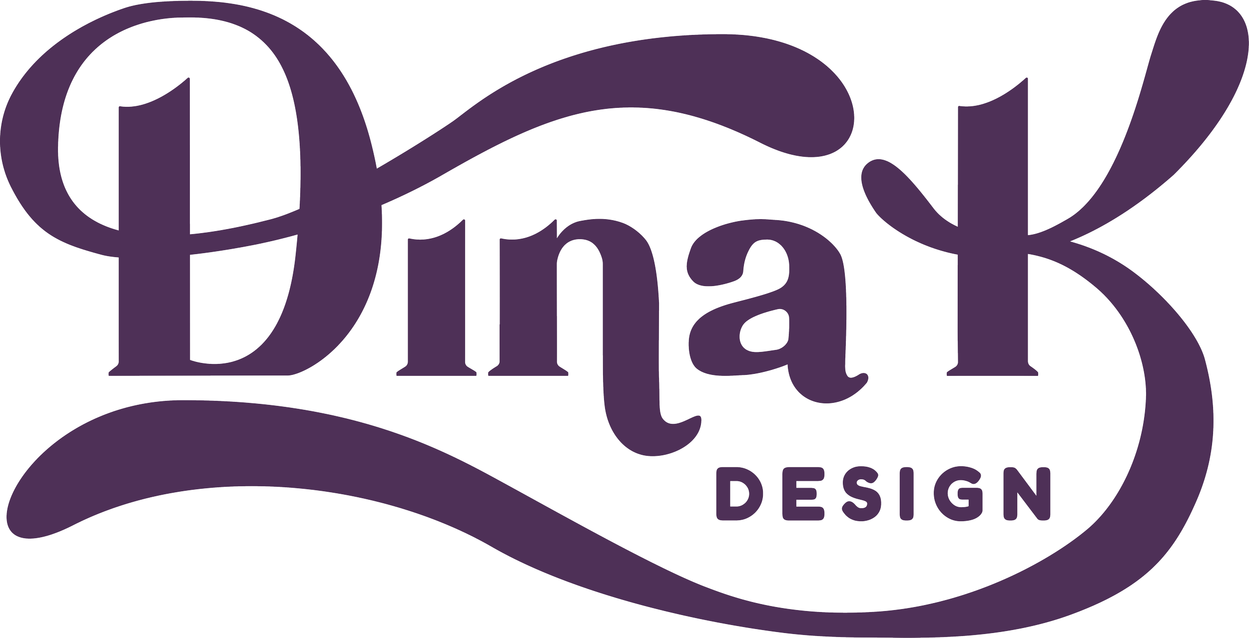
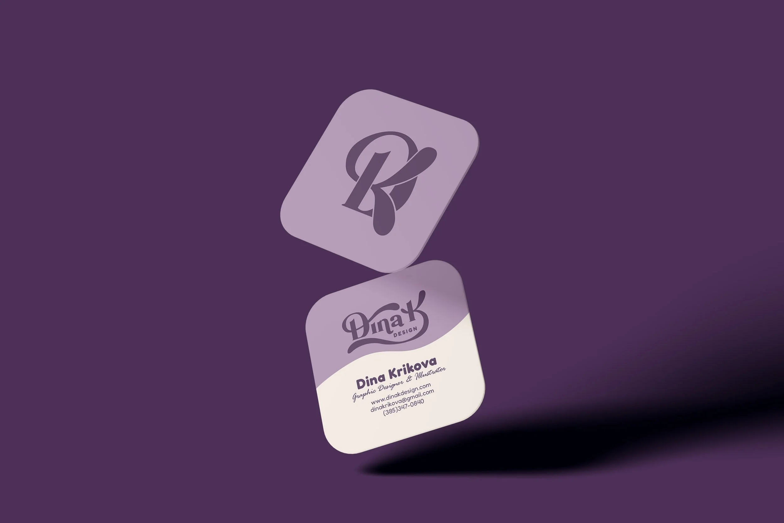
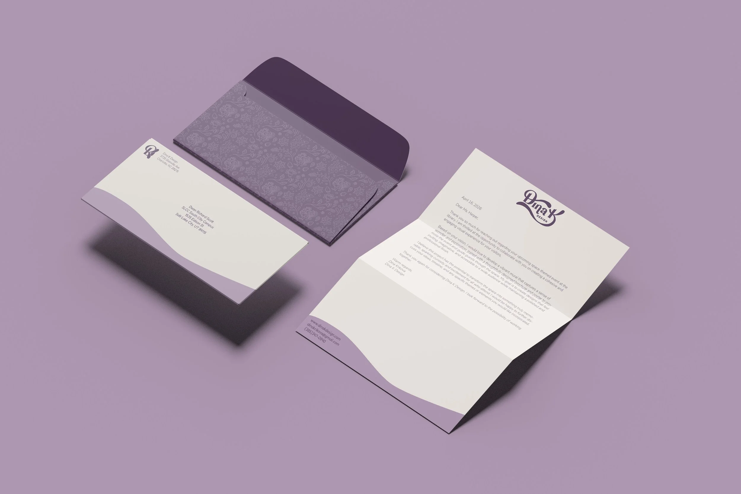
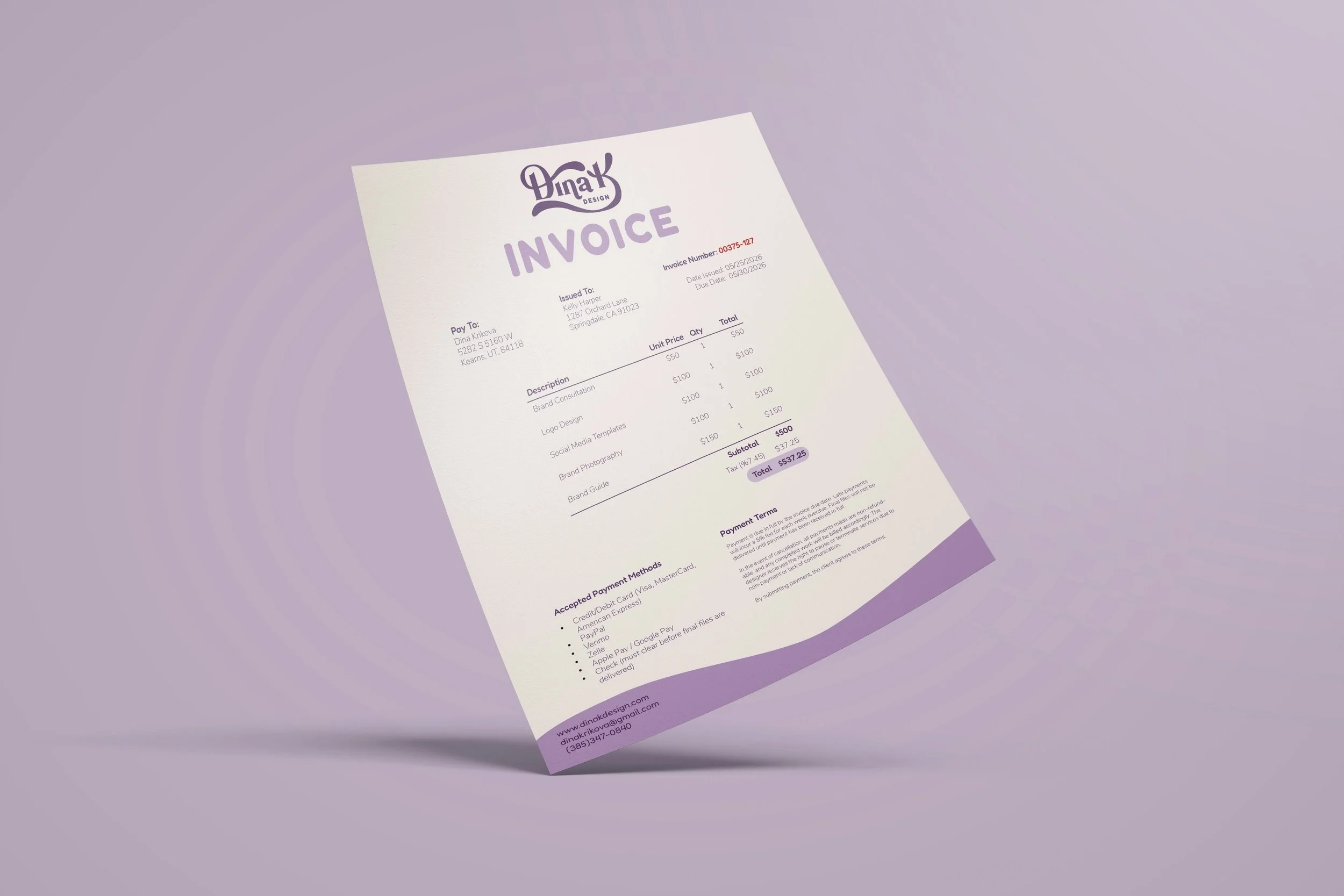
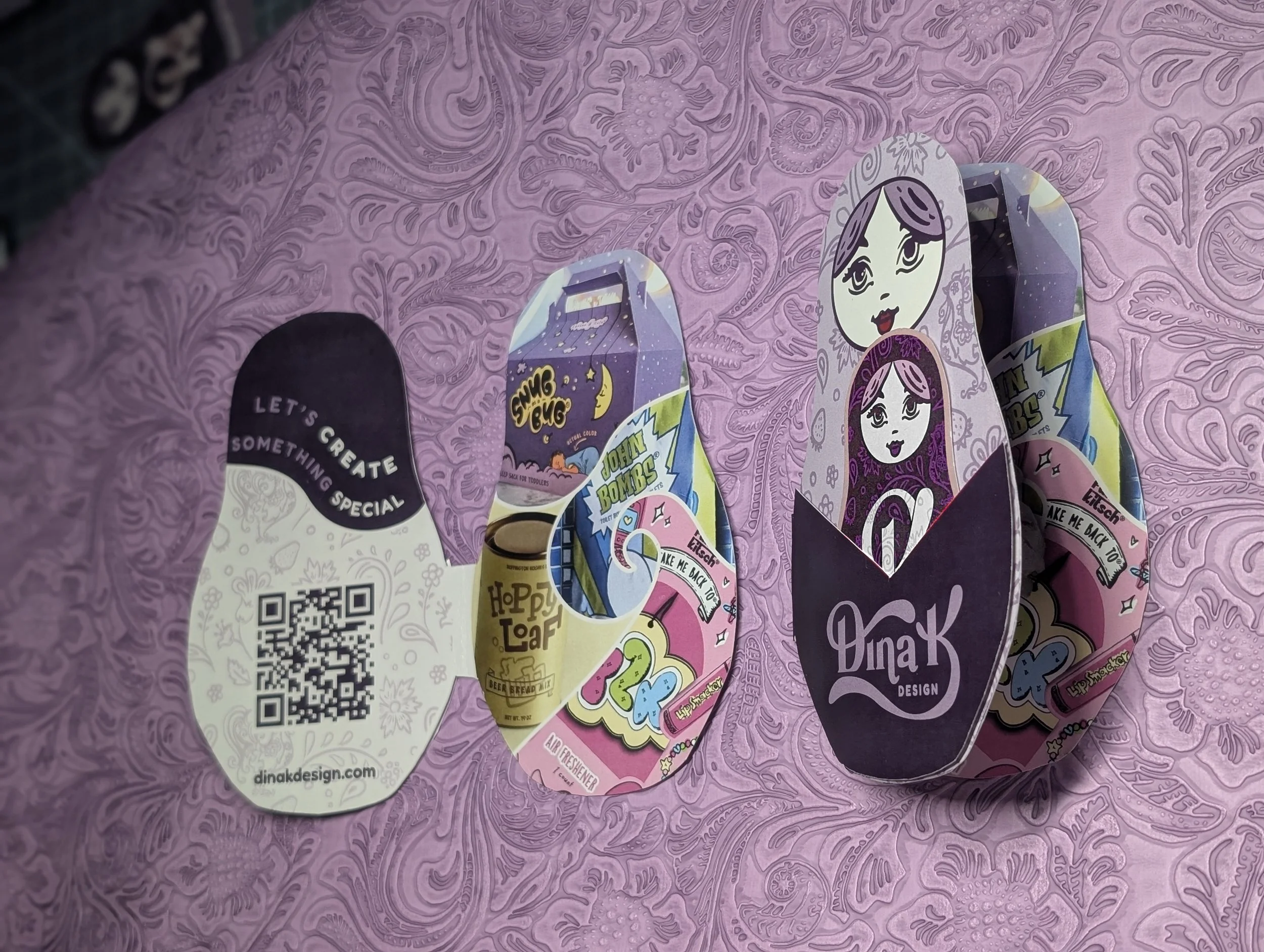
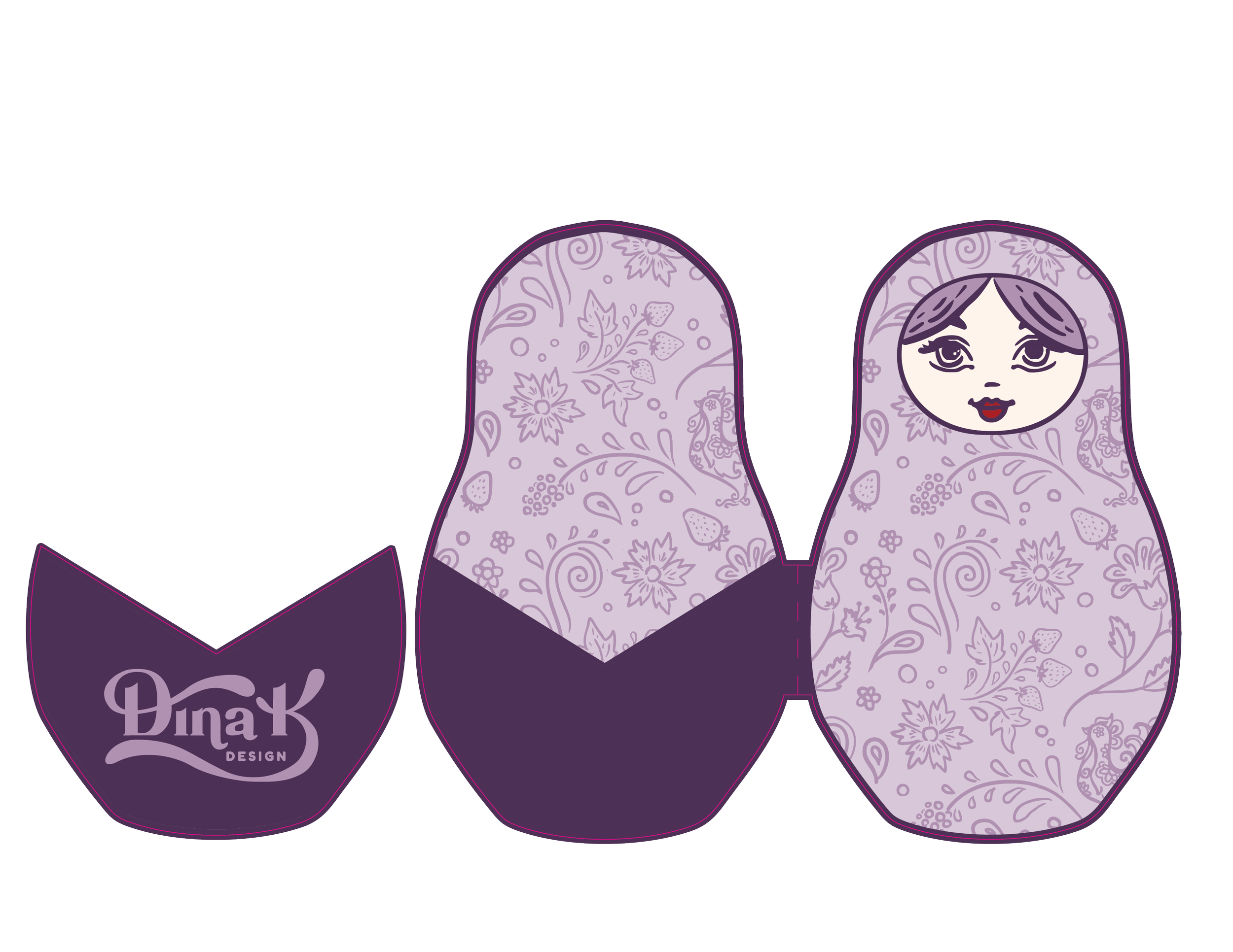
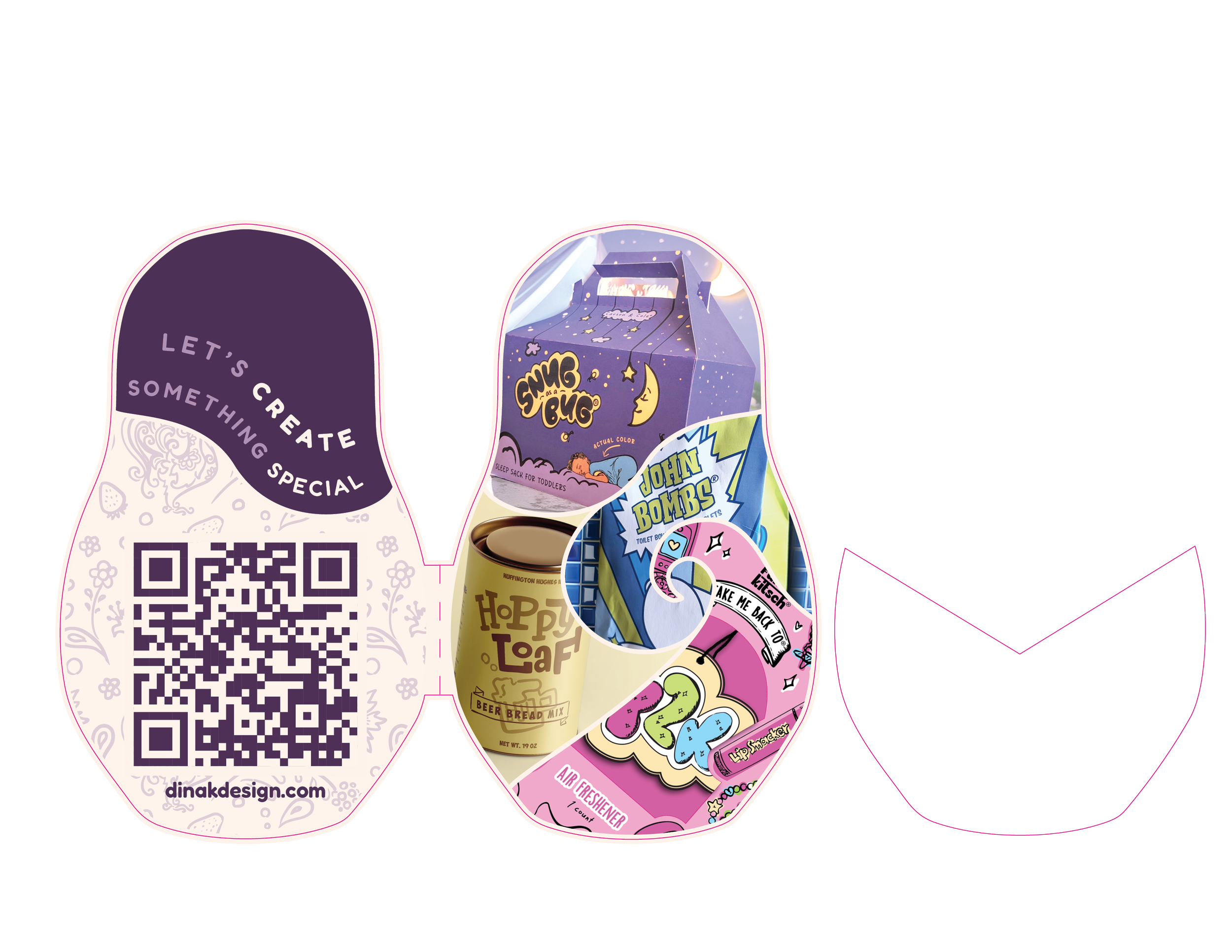
Dina K Design is a reflection of my design style that feels both whimsically inviting and intentionally crafted.
The brand balances a friendly, optimistic tone with a strong sense of professionalism, emphasizing design that is both expressive and dependable.
Rooted in my cultural background and my extended experience in hand-rendered signage, I developed a custom typeface for my logo, featuring rounded forms and bold brushstrokes, bringing an organic, unique touch to the identity.
The color palette, playful yet refined, combines soft lilac, rich eggplant, and warm cream to create a sense of harmony, warmth, and visual confidence.